Close

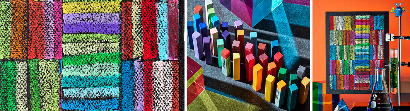
Oil Pastels Color Study
Lesson Plan, Grades 6-12, Math, Science, Sakura, Drawing
Description
Lesson Plan and Artwork by Annette Johnson
The color wheel shows the relationship between colors and is the basis for Color Theory. Color Theory is a combination of art and science that helps determine which colors look good together. Isaac Newton’s experiments with prisms in the mid 1600’s led to the discovery of visible colors: red, orange, yellow, green, blue, indigo and violet. His experiments led to the theory that red, blue, and yellow were the primary colors from which all other colors derived. The secondary colors violet, orange, and green are created by mixing the primary colors with each other. Further mixing the primary color with the secondary colors result in tertiary colors: yellow-orange, red-orange, red-purple, blue-purple, blue-green, and yellow green. Primary, secondary, and tertiary colors are the basis for the color wheel in common use today. Students will use Cray-Pas Specialist Oil Pastels to create a visual color study showing color relationships between various pigments.
Objectives
- Identify, chart and study the relationships of warm, cool, complementary, and analogous colors.
- Create reference charts for each of these color groups.
- Study the relationship between warm and cool colors when placed next to each other.
- Discuss how placement of colors change how they look, feel and what mood they create.
Supplies Needed
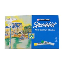
Sakura® Cray-Pas® Specialist™ Oil Pastels, 21/2 x 2/5 x 2/5 Inches, Assorted Color, Set of 50
Color Wheel Students Color Wheel, 51/8 Inches
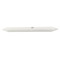
Jack Richeson™ Double-Pointed End Blending Stump, Number 6, Pack of 12
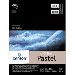
Canson® Mi-Teintes® Drawing Pad, 9 x 12 Inches, 98 lb, Black, 24 Sheets
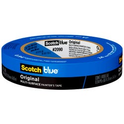
ScotchBlue™ Original Painter’s Tape, Multi-Use, 0.94 Inch x 60 Yards
Standards
Standard #1: Generate and conceptualize artistic ideas and work.
Standard #4: Analyze, interpret, and select artistic work for presentation.
Standard #7: Perceive and analyze artistic work.
Standard #10: Synthesize and relate knowledge and personal experiences to make art.
Instructions
1
Cut 1” off the 12” length of the black Mi-Teintes paper – the finished size will be 9” x 11”.
2
Measure in ½” from all four sides. Tape the black paper to a board along this outline.
3
The 8”x10” inside masked area will be your working surface.
4
Measure in every 2” from the short side of the paper. You will have 5 equal stripes 2” x 8”.
5
Turn the paper so the 8” side is facing. Place a piece of painter’s tape from left side to the right side at the first pencil mark. You now have a row 2” x 10” masked off.
6
Choose a range of colors to start with, they can be warm, cool, analogous, or complementary.
7
Grasping the long edge of the oil pastel, placing the short edge flat against the paper’s surface draw a line of color from the top to the bottom of the masked area. Continue placing one color next to the previous color until the masked area is filled.
8
Gently pulling on an angle, remove the tape from the top edge of the colored row.
9
Place a new piece of painter’s tape gently on the top of the color strip you just completed and another strip of tape on pencil line 2” above this.
10
Fill this masked area with your second group of colors filling in from one side to the other. Continue in this manner until your paper is filled.
11
How you choose to place your colors on the paper will determine the final look and feel of the color relationships. Use this as a basis for colors selected for future works.
12
Gently remove all tape from the surface of the color study. Observe and discuss how your chart looks and feels.